In the buzzing world of digital marketing, capturing your customer’s attention is as critical as striking oil. Your web page’s first impression could be the make or break in your slide from bounce rates to conversion. But how do you construct the perfect persuasion formula to captivate your audience from the word ‘go’? Welcome to the art and science of the persuasive page format.
The Hero Section: Begin with the Wow Factor
Imagine the hero section of your page is the grand entrance to a star-studded event. It’s your red carpet, and it must awe and inspire. Here, it’s not about you; it’s about what you can do for your customer. Paint a picture of how your solution banishes their pain points and delivers a shining result. Use a blend of striking visuals, snappy headlines, and an engaging hook that compels them to scroll further and uncover more.
Visuals that Speak Volumes
Invest in images that do more than show a product or service—they should visually articulate your customer’s deepest aspirations, or their nightmare turned dreamy. Beyond glossy surfaces, human faces and body language in your visuals can resonate with viewers, establishing an emotional connection.
Powerful Headlines and Hooks
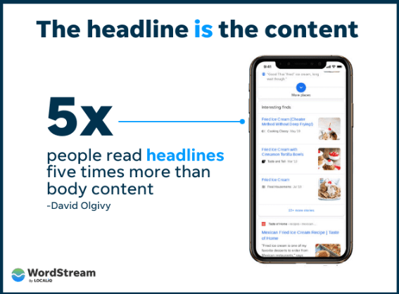
Your headline should telegraph an immediate benefit or a promise to solve a problem. The hook, a blend of the empathetic and the enigmatic, should tease further without giving it all away. “Discover a Sleep Revolution” might be the headline for a mattress company, followed by a question: “Is a Better Sleep Within Your Reach?”
Problem/Solution Mapping: Walk in Your Customer’s Shoes
When they say, “Put yourself in your customer’s shoes,” they really mean immerse yourself. This section should mimic the thinking process of your customer as they acknowledge their need and look for a solution.
Speak Their Language
Avoid jargon and business-speak. If your customer is a concert pianist looking for the perfect practice keyboard, don’t talk about soundwave technology—talk about the ability to practice ‘full-herd’ without disturbing neighbors during nocturnal Beethoven.
Offer a Path to Resolution
Lay down your customer’s issue, swiftly followed by your solution. Use clear, direct language to describe how your product or service bridges the gap. Use bullet-point lists to highlight the features that lead to resolution to make the navigation of information as smooth as playing scale arpeggios.
Products/Services Showcase: Beyond the Bullet Points
The product or service section is typically dry if it’s just a list of specifications. You’re essentially performing ballet here; every feature and detail must flow like a choreographed sequence, telling a story of excellence and utility.
Bullet Points to the Beat
Each feature should resonate with the customer’s core concern. For instance, a digital camera’s burst mode isn’t just fast—it ensures not a single ballet leap or child’s giggle is missed; it captures each in perfect frames, every time they’re unseen.
Visual Aesthetics and Subliminal Messaging
The arrangement of product images and benefits should have an unconscious messaging linked to them. Subconsciously, you can lead the customer’s eye towards the CTA or the most compelling feature, steering the focus as subtly as a grand jeté.
Benefits Spotlight: The Heart of the Matter
Here is where your customer isn’t just educated but seduced. They need to see how your solution seamlessly integrates into their lives and improves their existence.
The Before and After Effect
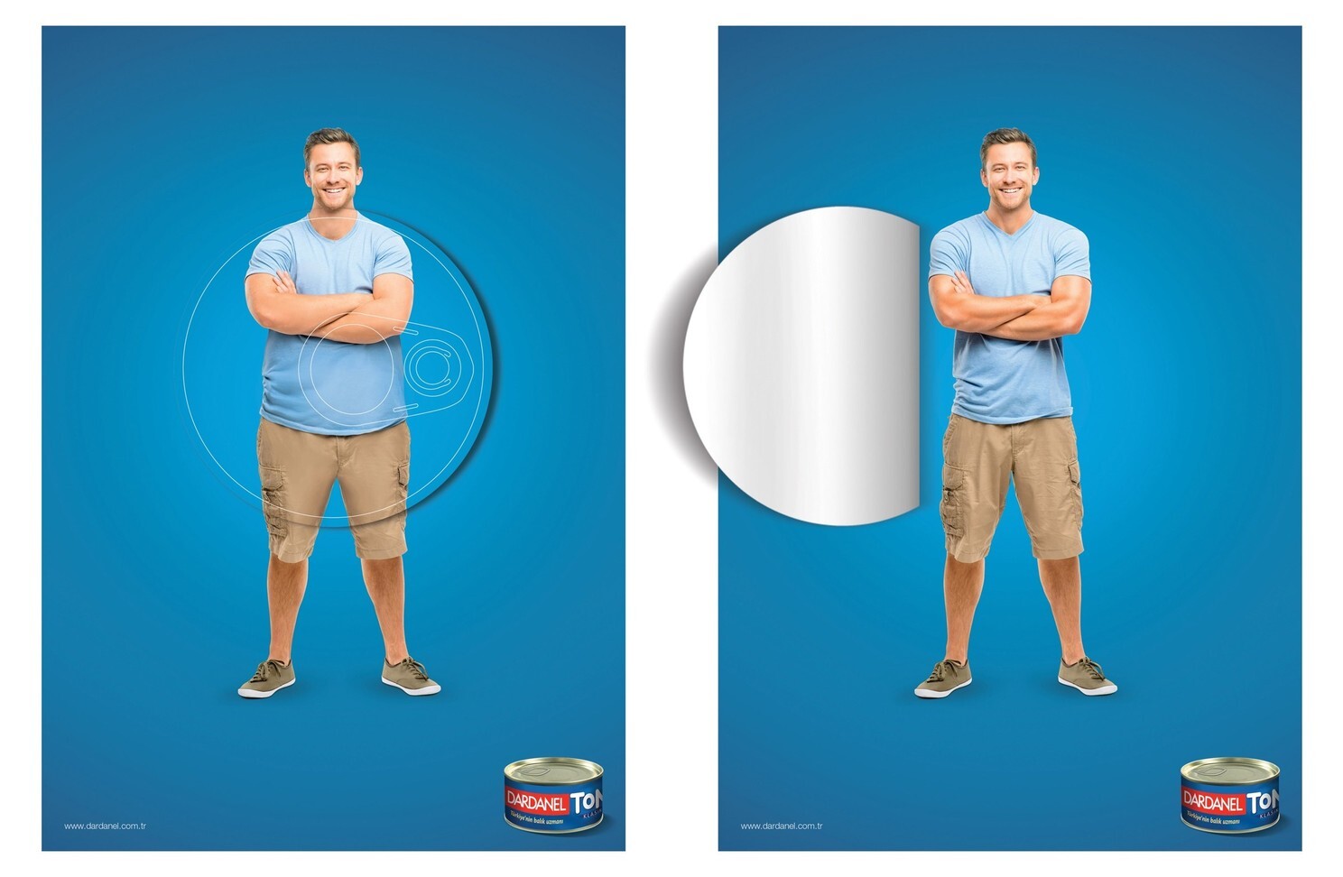
Visual representation of the before and after effect paints a powerful story. Use graphics to illustrate the current struggle alongside their life after choosing your solution. It’s the transformational arc found in every compelling tale.
Language of Satisfaction
Adjectives and ache-points need to collide here. If your app makes financial tracking ‘effortless,’ say it. Detailed statements like ‘never miss a payment’ or ‘achieve your financial goals with precision’ cut through the noise and resonate.
Testimonial Spotlight: The Social Proof Push
If the preceding sections are your argument, testimonials are the jury’s verdict. Real people, genuine satisfaction; testimonials add weight to your persuasive efforts.
Varied Voices for Echo Effect
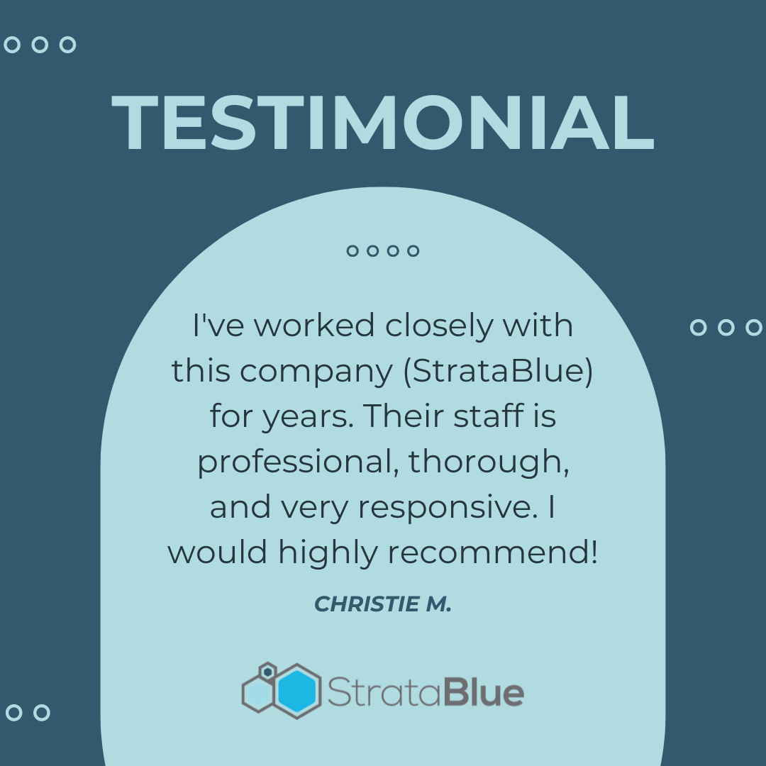
Gather testimonials from a range of users: the newbie, the expert, the conservative, the bold. They serve as reflections for different customer profiles, allowing your audience to see themselves and anticipate their own post-purchase satisfaction.
Anecdotes that Echo in the Mind
Encourage detailed testimonials that read like stories. Not just “I love the product.” Rather, “Since using the product, my workouts are powerful and uninterrupted. It’s my secret weapon.” Anecdotes stick. They’re more likely to be remembered and retold.
Features Section: The Nitty-Gritty Masterpiece
The features section should provide a clear understanding of how your product or service functions. However, it’s easy to get muddled in minutiae. To avoid this, present it as the heart of how benefits are delivered.
Breaking Down Complexity
If a feature needs an in-depth explanation, offer an ‘open the bonnet’ approach, revealing the engine but in a way that doesn’t sound like a car manual. Use simple diagrams and plain language, not technical terms that require a dictionary sidekick.
Highlight Technological Advantages
If there’s groundbreaking tech behind your product, this is the place to mention it. However, ensure it’s explained in layperson’s terms and that you express how it directly affects your customer’s life for the better.
FAQ: Addressing Doubts Head-On
A comprehensive FAQ segment is like speaking to your customer’s mind. It confronts their doubts and assuages them before they turn away.
Anticipate Concerns
Your FAQ should be a repository of queries you get most often. Addressing issues related to price, convenience, and efficiency can level up the customer’s desire to solve their problem with your solution.
Transparent and Honest
Don’t shy away from difficult questions in the FAQ. If cost is high, explain why the value proposition trumps it. If there are limitations to what your service can provide, make them clear and offer alternative solutions or workarounds if available.
Call to Action Block: The Moment of (In)Decision
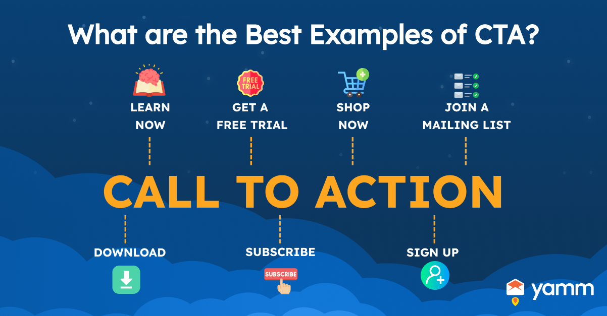
The CTA block is the crescendo of your persuasive page symphony—a clear and compelling ask that allows your visitor to take action.
Clarity is Kind
Use a button that states what happens next. “Start Your Health Journey Now” is clearer than “Submit.” The text should be action-oriented, directly linked to the benefits you’ve showcased.
Incentivize Action
If you can, add an incentive for immediate action. Whether it’s a limited-time discount, bonus features, or a free consultation, provide a carrot that makes the action an irresistible response to their arousal.
Creating a persuasive page is an ongoing harmonization of customer needs, product showcases, and subtle emotional nudges. With each tweak, you conduct a new performance that can lure and hold the attention of an audience. Sharpen your art, refine the science behind it, and keep innovating. Next time your audience lands on your page, make sure you’re not just speaking to them—you’re whispering directly to their psyche, nudging them closer to the conversion you desire. Remember, they’ve come for a reason; your page’s duty is to ensure they leave with the resolve to act upon their need.


