First and foremost – hello! My name is Clay Coomer and I’m the newest member of the StrataBlue digital marketing team. I serve as the Digital Marketing and Client Services Manager for StrataBlue. Basically what that means is not only do I help plan and execute client marketing plans, but I also play a big role in creating/executing marketing plans for StrataBlue to increase our brand exposure, as well! But enough about me; on to the topic at hand, and if I do say so myself – it’s rather important to your business. I was inspired to write this post after looking into one of our client’s Google Analytics data. As I navigated through various reports analyzing traffic patterns and such, I stumbled upon some information that was very telling to me. Here’s the story…
Let me start by adding a disclaimer – I’ve been using Google Analytics to report and analyze website traffic for the better part of three years. Up until last week, I didn’t fully comprehend the depth of insight one can attain by simply navigating the platform and drilling into the data. So… last weekend, while my kids sleep schedules fell into perfect alignment, I got the itch to dive into a client’s Google Analytics data. And, just by playing around with reports, I discovered…
47% of their pageviews occurred on a mobile device
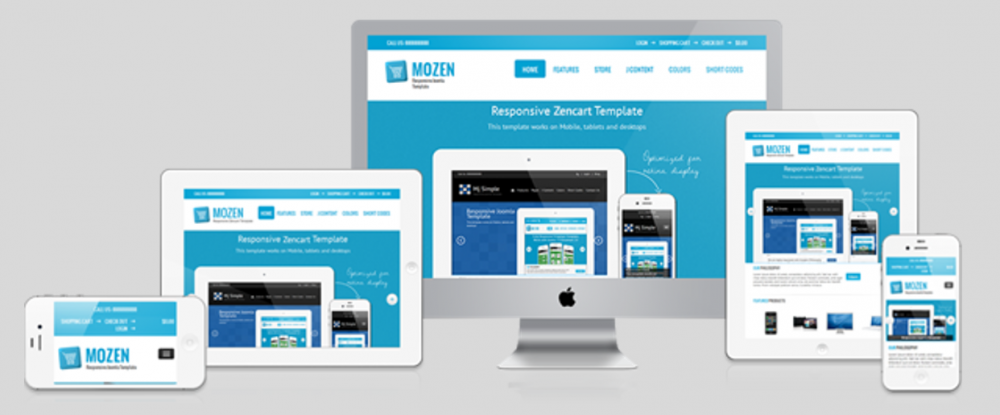
When I broke the traffic down by device, the data was separated by desktop, tablet, and mobile. Mobile had the highest share of pageviews from the previous 30 days’ worth of collecting data. Why is this significant? This client’s website isn’t mobile responsive. With over 60% of Americans owning a smart phone, it’s no secret that websites will inevitably be viewed from their phones. When the website isn’t optimized for mobile devices, the user experience takes a colossal nosedive. This is indicative by the title of this post. You’re begging to know those 3 signs, right? Well wait no more – because here they are.
The obvious one: increased bounce rate
Bounce rate is defined as the number of sessions that occur on your site that are the dreaded one and done visits. Sometimes one and done isn’t necessarily a bad thing. Especially for landing pages. In most instances though, if a user visits your website and leaves without viewing more content, there’s a strong likelihood it’s because they didn’t like what they saw or had a poor user experience. You can find this data for your own website in Google Analytics: Audience > Mobile > Overview report. For the client I was analyzing, they had an increased bounce rate of 9% compared to sessions that occurred on a desktop device … Here’s your sign!
Decreased number of pages viewed per session
This stat falls in line with the increased bounce rate. If more people are leaving your site after only viewing one page, your pages per session will also be down – compared to users who visit on a desktop device. In my analysis, I was able to deduce that people viewing the client’s website on a mobile device viewed (on average) 3 pages per session. But on a desktop, people were viewing (on average) 4.5 pages per session. It’s not an overwhelming statistic, but one that is worth noting … Here’s your sign!
Decreased session duration (time on site)
When it comes to the Internet, 22 seconds is a long time. To put it into perspective, statistics suggest that if page-load time goes over 4 seconds a visitor will lose patience and bounce before even viewing any content. For this analysis specifically, sessions were 22 seconds longer on a desktop compared to on a mobile device. A lot can happen in 22 seconds. I wouldn’t be talking about it if it wasn’t important … Here’s your sign!
I get it, Clay. My website needs to be mobile responsive
So, what are our next steps? For the client I am talking about, we are presently in the middle of redesigning their website. And, yes, it’s absolutely going to be mobile responsive. Hopefully when the redesign is complete, I can report back and do a case study about how their website is now kicking ass in the mobile department. For now, though, those results are TBD…
But what about your website? Is it mobile responsive? If you’re not sure, let us take a look. Give us a call at 317-207-0195 or click the button below to fill out a brief form to contact us online.


